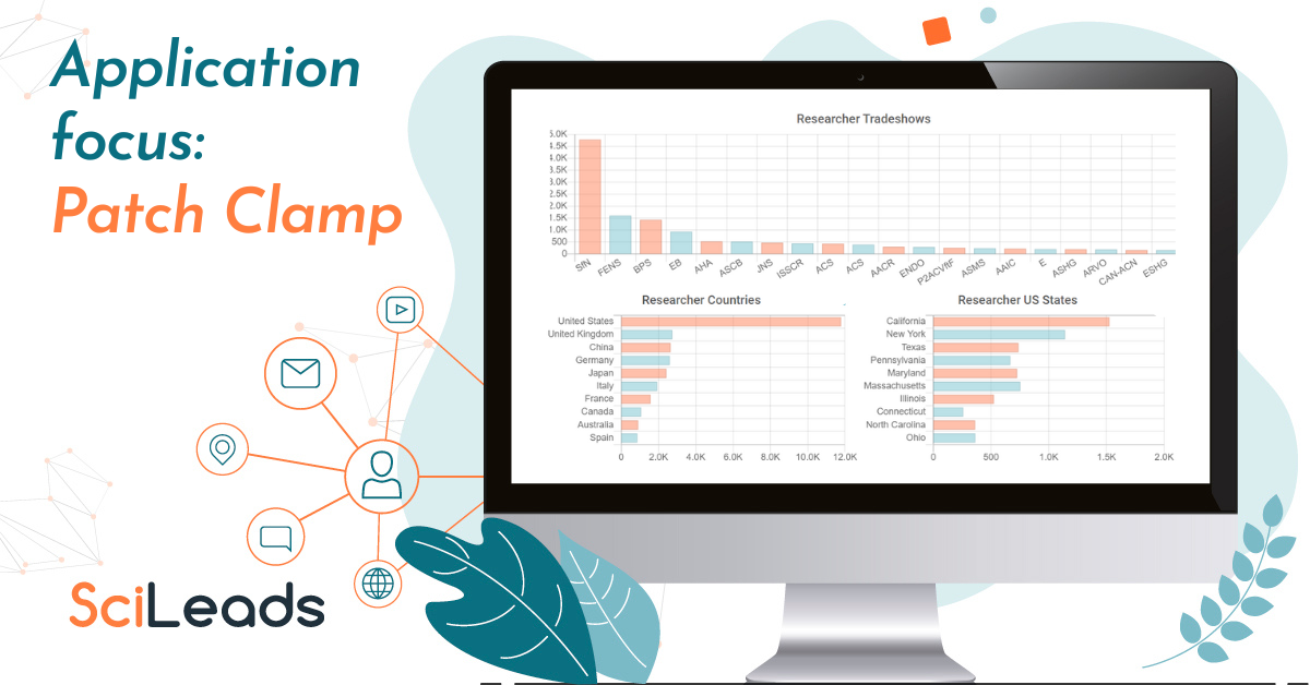
We’ve used our Data Visualisation feature to show the overview of patch clamp. This graphical representation of the search results provides you with an accessible way to understand trends, patterns, and outliers from the extensive SciLeads data.

In this chart which details which tradeshows patch clamp researchers attend, you can see that Society for Neuroscience (SfN)) has had 4.8k researchers present whereas the Federation of European Neuroscience Societies (FENS) is second with 1.6k.
The Data Visualisation feature provides a high-level overview of the statistics, whereas users can also click the ‘Researcher Tab’ in the SciLeads platform to explore the poster talk sessions in more detail.

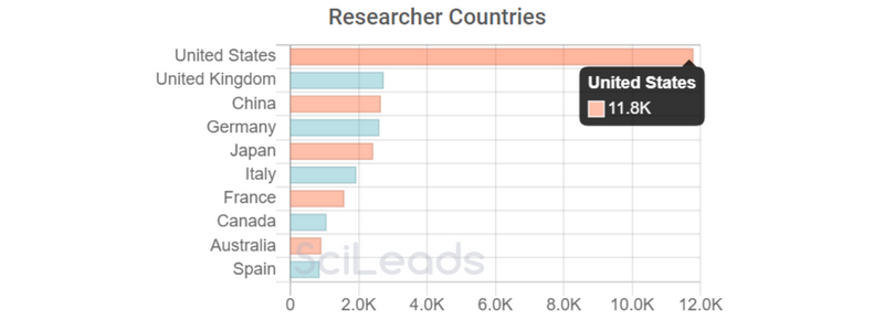
As you can see, the US has had by far the most researchers for patch clamp with 11.8k, followed by the UK and China which have 2.7k respectively.

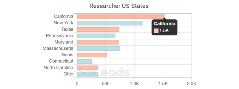
A deep dive into the data shows that the state of California has the most researchers with 1.5k. Followed by New York with 1.1k researchers.
This is just some of the data available to view for this application area in the platform. If you want to run this keyword yourself and get even further insights, get set up with a demonstration and trial here.
Have a data visualization suggestion? If there are other charts and insights you think this feature could show, please send your ideas via our contact us page.


