Features
3
2
Researcher Profiles
Organization Profiles
Tradeshow Calendar
Search Builder
Purchasing Data
CRM Integration
Solutions
3
2
Sales
Marketing
Startups
CROs
API
AI Partner Program
Pricing
Events
Resources
3
2
Blog
Case Studies
eBooks
Webinars
Newsletter
Company
3
2
About Us
Careers
Testimonials
Partners
Press & News
Contact
Login
Free Trial
a
M
Features
3
2
Researcher Profiles
Organization Profiles
Tradeshow Calendar
Search Builder
Purchasing Data
CRM Integration
Solutions
3
2
Sales
Marketing
Startups
CROs
API
AI Partner Program
Pricing
Events
Resources
3
2
Blog
Case Studies
eBooks
Webinars
Newsletter
Company
3
2
About Us
Careers
Testimonials
Partners
Press & News
Contact
Login
Free Trial
Solutions
Sales
Marketing
Startups
Pricing
Events
About Us
Resources
Blog
Case Studies
eBooks
Webinars
Newsletter
Careers
Archive
Reports
Reports
State of the Market Report – Patch Clamp
Rachel Lively
Reports
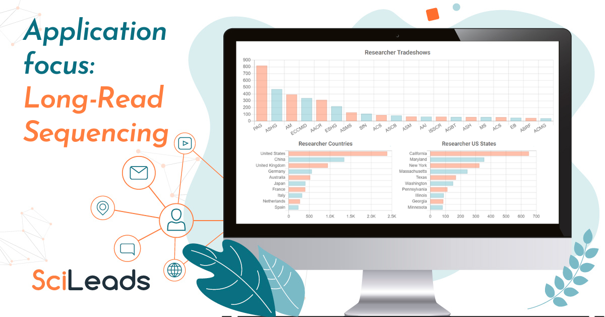
State of the Market Report – Long-Read Sequencing
Rachel Lively
Reports
State of the Market Report – Proteomics
Rachel Lively
Reports
State of the Market Report – Atomic Force Microscopy
Rachel Lively
Reports
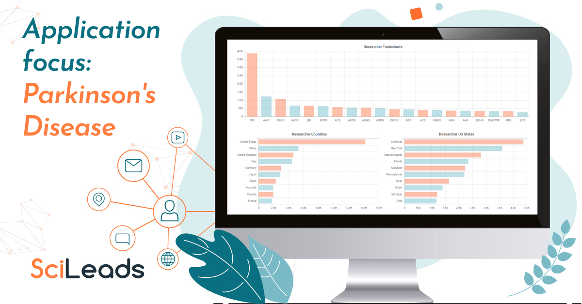
State of the Market Report – Parkinson’s Disease
Rachel Lively
Reports
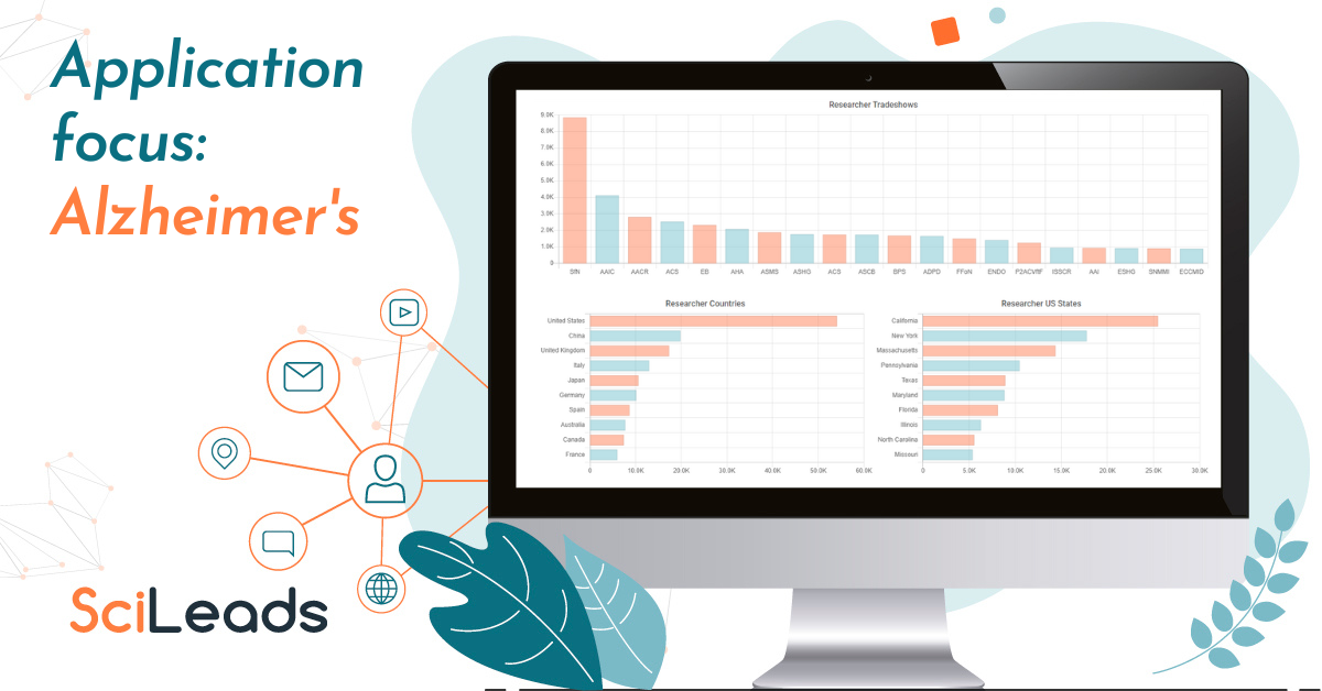
State of the Market Report – Alzheimer’s
Rachel Lively
Features
Researcher Profiles
Organization Profiles
Tradeshow Calendar
Search Builder
Purchasing Data
CRM Integration
Solutions
Sales
Marketing
Startups
CROs
API
AI Partner Program
Pricing
Events
Resources
Resources
Blog
Case Studies
eBooks
Webinars
Newsletter
Free Tools
Event Finder
Funding Search
Publications Search
Tradeshow Data
Company
About Us
Careers
Testimonials
Partners
Press & News
Contact
Free Trial
Login